
By Josh Bookbinder
Topps baseball cards are iconic. The first set that Topps released came out in 1951 in the spirit of earlier tobacco trading cards; ever since, they’ve released yearly sets with unique designs.
Thanks to The Cardboard Connection, we can take a look at an example of every standard design Topps has produced since 1951. I’ve listed my top 10 designs in order below, along with pictures pulled from that Cardboard Connection site; after you read, check it out and see if your favorites line up with mine.
Keep in mind, I’m rating these purely on looks. I’m not an avid collector; I would consider myself more of an appreciator of both the history and the idea.
10. 1972
I’m going to start off a little controversial with this one and go with 1972’s design. The psychedelic-esqe popping team name at the top won’t do it for everyone, but I love the unique look, especially contrasted with the very clean, plain all-caps of the player name at the bottom.
This set is mainly known for having Carlton Fisk’s rookie card, but also has some legends with some great cards like Roberto Clemente and Henry Aaron.

9. 2006
This is the only design where I’ll truly let my heart interfere; but really, who can blame me? Every baseball fan has the one design set that they love because it’s their set, and this is the one for me. I remember getting a 2006 complete set for Christmas and giddily looking through, finding all my favorite players and loving every moment of the search.
I personally love this design. It bridges the gap between an older feeling design and a more modern one, combining elements of both into a perfectly mid-aughts style.
A snafu regarding rookie rules and timing issues make Alex Gordon’s card #297 the most valuable rookie card in the set, and the rarest. It also contains some other fun young guns like Justin Verlander and Ryan Zimmermann.

8. 2018
The only card design after 2010 to make the list, 2018 is one of the rare instances where a “modern” design works. Most of the player images are nice action shots, and the only real design is the nameplate at the bottom, which is sort of a crumbling look on the right edge and a weird slide-thing in team color with the team logo on the left.
It’s an odd combination of elements, but it works in my eyes. I particularly like the commitment to high-quality action shots. and the nameplate design works with those. In terms of players themselves, this set is the one that has Shohei Ohtani’s rookie cards, which of course are bound to be very sought-after.

Clint Frazier jumpscare!
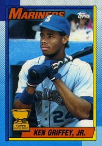
7. 1990
The 1990 set was interesting in that it had a lot of color and none of it made sense. The dotted gradient border combined with the nameplate and team name showed some wild flashes of color (not often team color), while the name itself was typically plain black. It’s a little busy, but it’s creative, which in my mind makes it fun; it’s certainly the best of the 90’s, which featured some experimental simplistic designs that just didn’t appeal to me very much.
Ken Griffey Jr has a nice card in this set, as shown in the example to the right, but his rookie card released in 1989; Frank Thomas, Bernie Williams, and Sammy Sosa were the headlining rookies from this class.
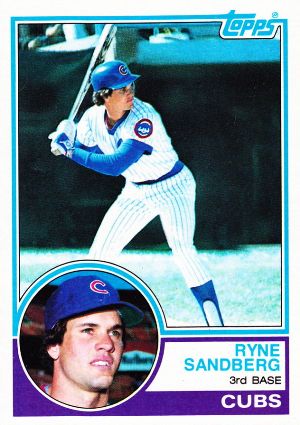
6. 1983
In the aforementioned 2018 set, retro inserts were created to mimic the 1983 set, and for good reason. The card design features two photos, a small circular portrait and a large action shot, and the text is all done cleanly and in color or negative space. The lines around the photos are dual-colored and the Topps logo is integrated into the design cleverly, which is a great touch.
This set contained rookie cards of Tony Gwynn, Ryne Sandburg (pictured), and Wade Boggs, may he rest in peace. Gwynn’s cards are notably valuable when in mint condition.
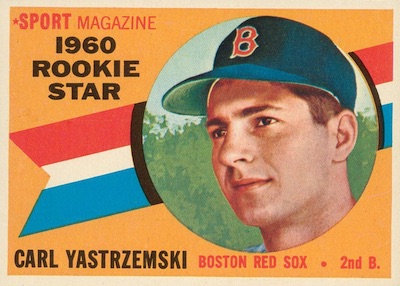
5. 1960
I’m typically not a big fan of the few horizontal designs that Topps did early on in the card era, but the 1960 version is the best of them. The colors are vibrant, the multicolored names pop, the team logos in the corner are great, and the combination of multiple images makes for a great looking card.
Another thing that makes this set great is the subset designs. I’ve put a Carl Yastrzemski “rookie star” to the right, but there were a more than a few very fine looking designs outside of the base set.
This set comes also at a great time in baseball history. Yastrzemski was a rookie, along with Willie McCovey, but Mantle, Mays, Aaron, Banks, and Clemente all have cards in this well-designed set. Quite the lineup.

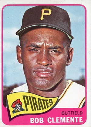
4. 1965
The ’60s are a gold mine in general, but I’m only going to drop one more from there on this list. The 1965 iteration of the Topps card set featured one image along with a simple border and nameplate, but the thing that stands out here is the pennant flag for the team name. I’m a sucker for a good pennant, and slapping it on the front of a card does something special for me. Combine it with that classic card back (below) and it makes for an outstanding overall card.
Four hall of famers have combined rookie cards in this set, as well as a few other notable players. However, in my mind, this will always be a set that I remember for the Clemente card that is pictured; not for any particular reason, I just think it’s really fun.

3. 2008
This is just the modern card they got right. The bubbled team names and player signatures give this card a retro look to go along with the modern pictures and foil nameplates. Everything just works, and it’s easily my favorite card design since the turn of the millennium.
It doesn’t hurt that some of my favorite childhood cards are in this set. Big Time Timmy Jim (right) is my guy and always has been, and this might be my favorite card of his. There’s a rookie card of Joey Votto as well. This series did get diluted with a ton of sub-par subsets and inserts, but the base design makes up for it. Like I said, it just works.

2. 1952
Can’t get better than the classic… almost. The first Topps card to truly follow the modern set style was released in 1952 and was just beautiful. The care taken in the design is evident, with player images being composed of one large illustration, unique logo boxes given for each team, and nameplates that also include faux signatures in an eye-catching box design that looks almost like an old-school theater sign.
The whole thing is just beautiful, in addition to it being the original; the history is just amazing, and I’d recommend the write up from the cardboard connection yet again to dive into it. Combine that with the fact that there are hall of famers galore in this set, and you’ve got something really special. I hope designs like this come back into vogue one day; certainly, there is a capability to do it, it’s just design and effort that’s holding us back.


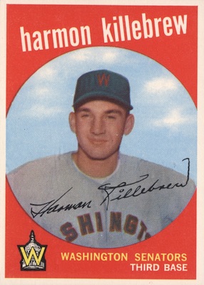
1. 1959
Oh, look. Perfection.
The all-lowercase. The faux-signatures. The unique team logos. The pop art-style circle picture. The colors. All the way down to the back of the cards: the design is clean, the colors pop; the cartoons aren’t unique to this set, but they fit so well in the overall design. It’s all so, so good.
The themes subset cards are gorgeous, as well. You have team photos, which fit with the pop design, and others like rookie stars, all of which have their own unique, well-done designs.

The whole set is just wonderful, and combined with the many stars and hall of famers that dominated the 60’s, it’s unequivocally the greatest set of all time in terms of visual impact. It tops plenty of lists across the internet, and holds a special place in lots of fans’ and collectors’ hearts.


This entire article was heavily sourced from the aforementioned cardboardconnection.com. I recommend checking out their site and clicking through if you’re a fan of cards or baseball history!
Josh Bookbinder is a writer for and co-founder of LowThreeQuarter. See more of his work and others’ work on the site through the links at the top of the page, or explore another recent article linked below.

What Is Wrong With Jonathan Loáisiga?
Jonathan Loáisiga once showed great promise but has struggled with command and performance since returning from injury. Analyzing his mechanics could reveal paths for improvement and shed light on how players look to improve.

Mike Marshall And The Oddest Cy Young Ever
The article highlights Mike Marshall’s remarkable 1974 season, where he set a record by pitching in 106 games without starting, winning the Cy Young, challenging current relief pitchers’ valuation.

Dream Weaver: The Birth Of A Star (Finally)
By Josh Bookbinder Luke Weaver was supposed to be here, but he also wasn’t supposed to be here. It doesn’t make sense, but it’s right. He’s Supposed To Be Here A decade ago, Weaver was a first-round pick of the Cardinals coming off of incredibly impressive sophomore and junior seasons for the Florida State Seminoles.…

Leave a comment